Overview
This was a design challenge I did for an interview with a medical company.
I had 48 hours to complete this challenge, and during this time I was able to conduct primary research, create low fidelity and high fidelity wireframes, and a prototype for demonstration.
This was all done in Adobe XD, as requested in the challenge.
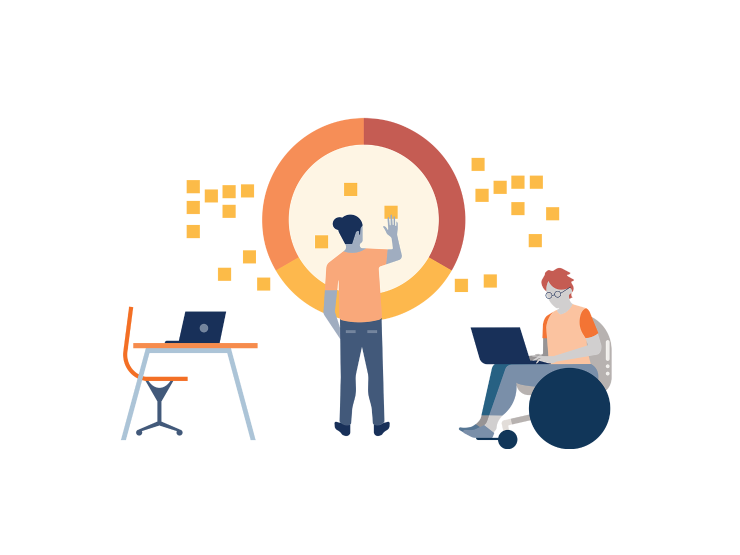
Problem Statement
As concerns over the Coronavirus (COVID-19) continue to grow, healthcare systems around the world are experiencing unprecedented strain as they race to provide care for the rising number of sick patients.
Design Constraints
Timeline: 48 hours
Platform: Web Application
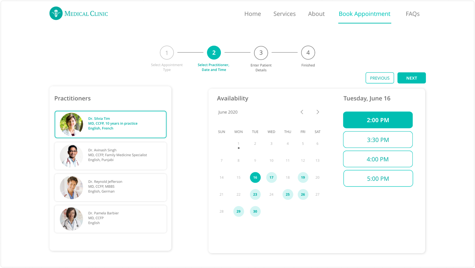
Other Conditions: Users must have the ability to compare different appointment times and doctors on the same page.
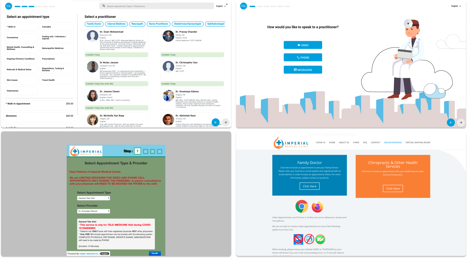
Competitive Research
I started by researching other medical clinic websites and seeing how they integrated booking systems into their websites. Most clinics had an option within the header to book an online appointment.
I found that after testing their systems I am always prompted to enter in my information before viewing appointment times, doctors, etc.
This roadblock could potentially deter users from continuing the process if users had simply wanted to view available times. Or if it was someone booking an appointment on behalf of a family member.
I took that into consideration while I was designing my own booking system.
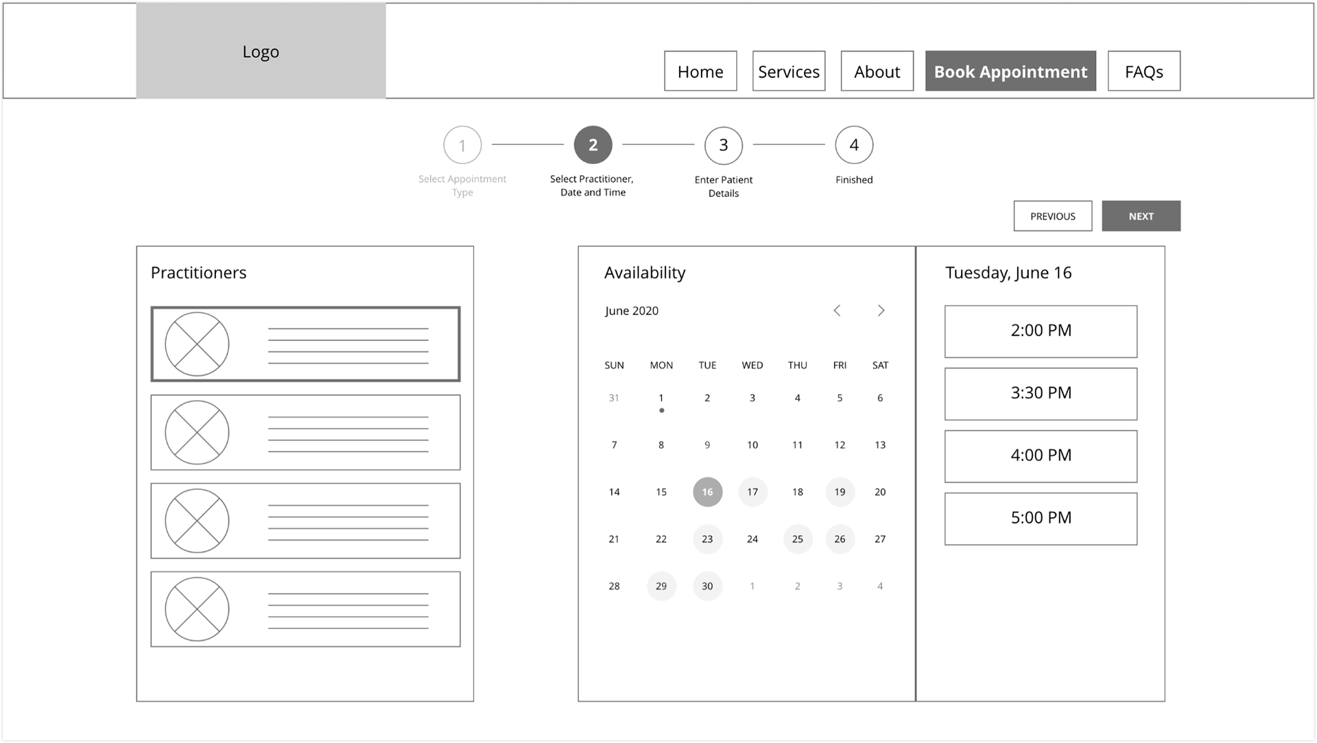
Low Fidelity Wireframe
After some comparative analysis, I started the low fidelity wireframes.
I took inspiration from applications such as Google Calendar and Calendly.
My goal was to keep it simple and to make the process of booking an appointment as easy as possible.
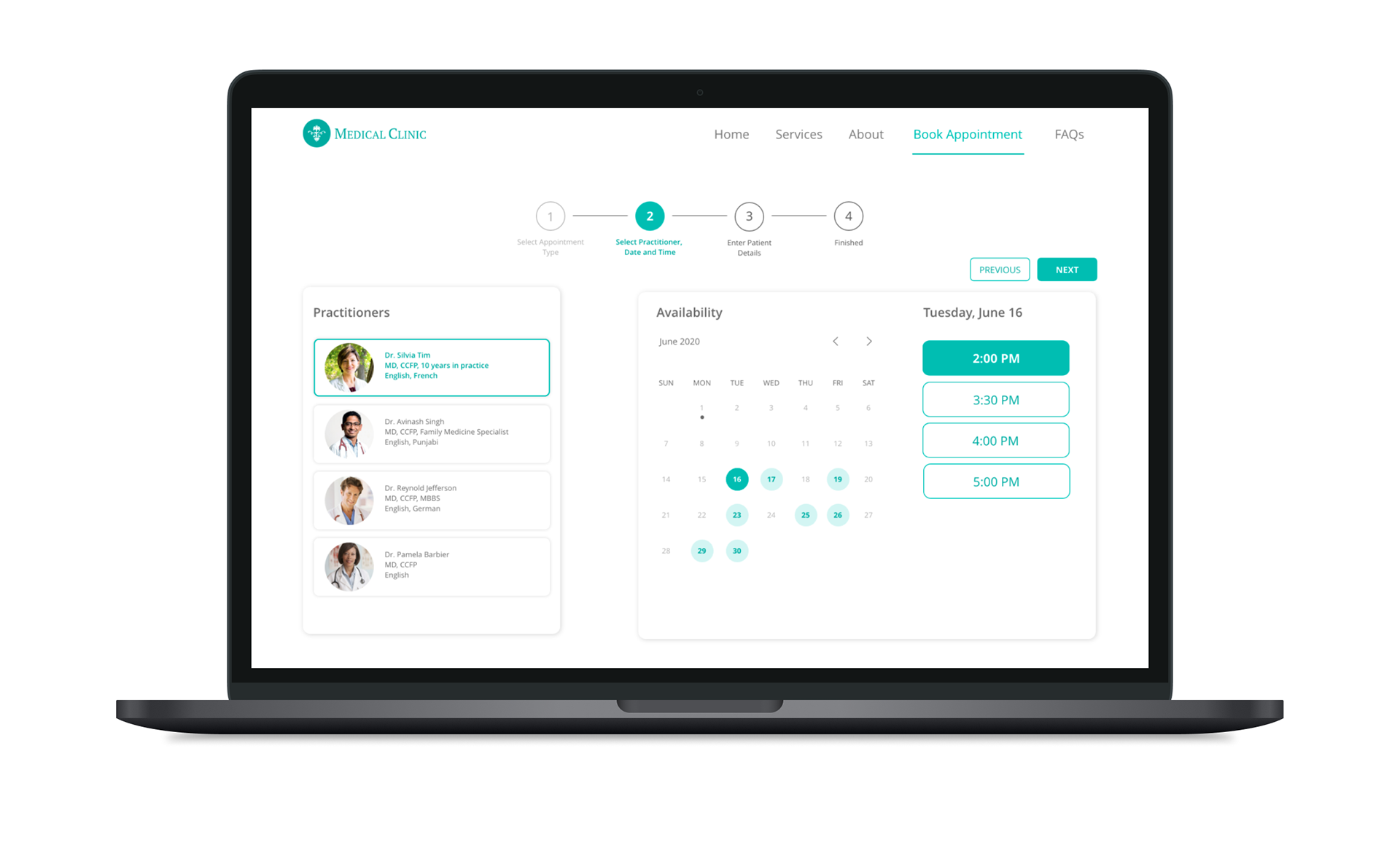
High Fidelity Wireframe
For high fidelity, I added just a little bit of colour, enough to make important aspects pop, but not too much that it detracts from the main purpose.
For this portion, I used the company's brand colour.
Prototype
Here's a preview of the prototype, showcasing the whole flow of booking an appointment with a doctor.
I added an option to set a reminder at the end of the appointment and kept the appointment information visible so that users are still able to see it.
Lessons Learned
This short design challenge taught me how to prioritize and tailor the design process to this project. 48 hours is not enough time to go through the entire process, therefore I had to pick and choose what elements I needed in order to maximize the time I was given and create something that was viable.
I was able to make it to the final interview, however, in the end, they selected the best candidate for the position. Despite the outcome, this was nonetheless a valuable experience in design challenges and the interview process.